


Why Your Prints Don’t Match Your Screen (And how to fix it)
The brochure looked perfect on your laptop screen. So, you clicked file, print, set the number of copies to 100, and let your printer do the rest.
You picked up your flyer and couldn’t believe your eyes. The colors were dimmer, duller, dryer.
You felt tricked. How could the colors be so vibrant on your screen but look so washed on paper? It must be the printer, right?
Actually, it likely had nothing to do with your printer.
Digital and physical mediums are basically two different languages, and things often get lost in translation. If you’ve ever felt this way after clicking print, you’re not alone. There’s a hidden trick to printing that often gets overlooked in the design process.
Here’s why your printed design may not look as vibrant as it does on your screen:
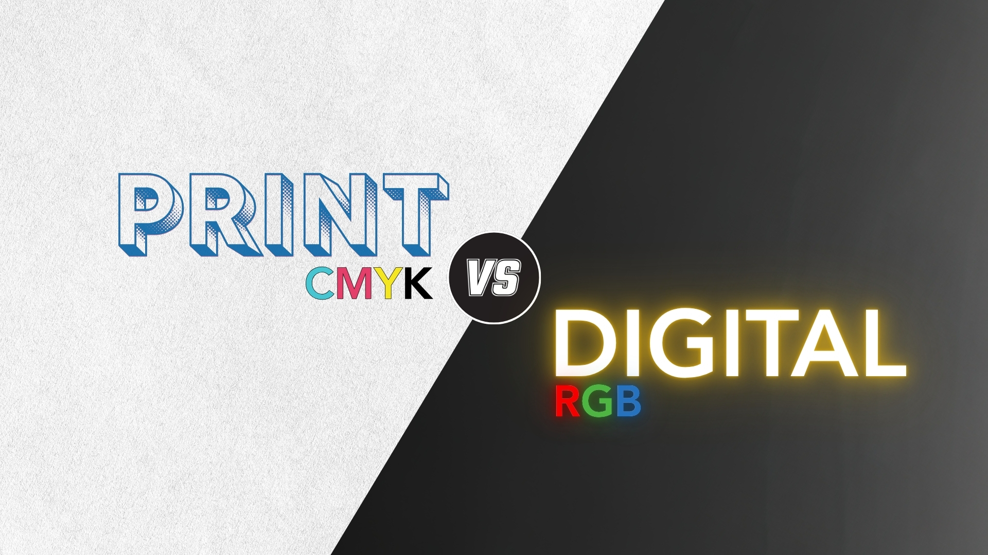
Print vs Digital: Why your colors change
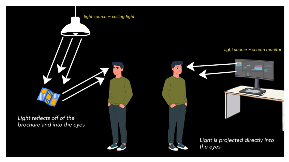
The difference comes down to one key concept: screens use light, print uses reflection.
When you view a design on a screen, colors are created by light being projected directly into your eyes. This makes them appear bright, vibrant, and full of contrast. Screens are designed to enhance this effect, which is why colors can feel so rich and even “glow.”
Print works differently.
Instead of emitting light, printed materials rely on ambient light reflecting off ink or toner on paper. That reflected light is naturally softer and less intense. The results are colors that appear more muted compared to what you see on a screen. On top of that, lighting conditions, paper type, and even your viewing angle can all influence how those colors look.
That’s why the same design can feel so different from screen to print. You’re not just seeing a color shift, you’re seeing a completely different way of producing color.
This is where RGB and CMYK come into play. These are the two-color systems built specifically for each medium and understanding them is the key to getting consistent results.
How to print correctly: RGB or CMYK?
If you’re designing anything that will be printed, the answer is simple: use CMYK (cyan, magenta, yellow, black).
RGB (red, green, blue) is built for screens. It creates color using light, blending those three colors at different intensities. Because it’s light-based, RGB can produce extremely bright, saturated tones, including colors that don’t exist in the physical world.
CMYK, on the other hand, is built for print.
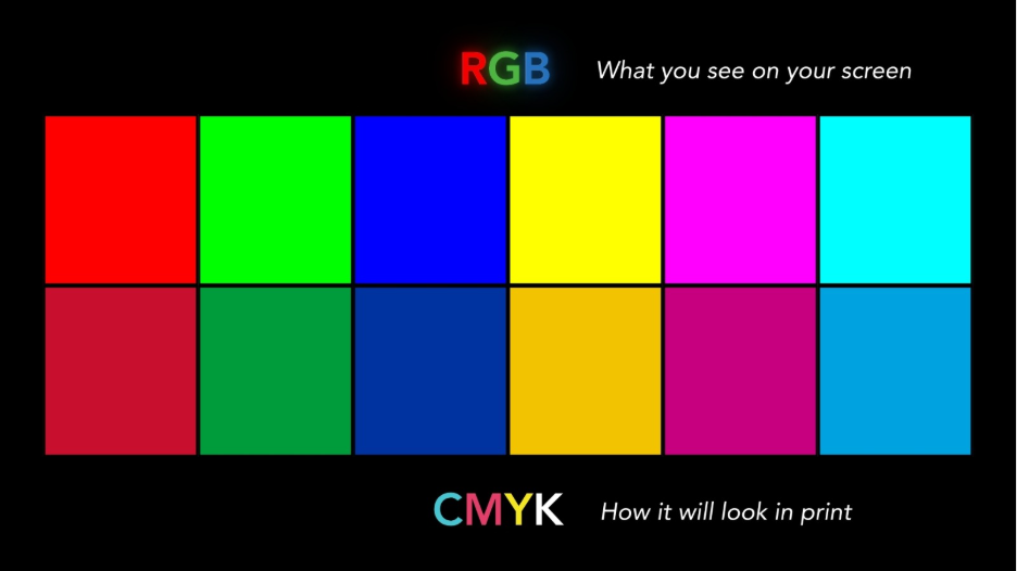
It uses ink or toner: cyan, magenta, yellow, and black. Instead of producing color with light, CMYK creates it by layering pigments on paper. These pigments absorb and reflect light, which naturally limits how vibrant they can appear. The more ink added, the darker the image becomes, which is the opposite of how RGB builds brightness.
Problems happen when you design in RGB and then print. Your printer has to convert those light-based colors into CMYK values. The computer is basically grabbing a digital-to-print translation book and trying to find the closest match.
Since many RGB colors fall outside of what ink and toner can reproduce, they get adjusted to the closest possible match, often resulting in duller or slightly shifted output.
Designing in CMYK from the start helps you:
- See a more accurate preview of your final print
- Avoid unexpected color shifts
- Stay within the real limits of ink and toner
In short, RGB is for screens, CMYK is for print. Starting in the right color mode ensures what you design is much closer to what you actually get on paper.
Still washed out?
If you’ve followed these best practices and your prints still aren’t matching expectations, then it might be time to look at your copier or printer.
Not all devices can handle color the same.
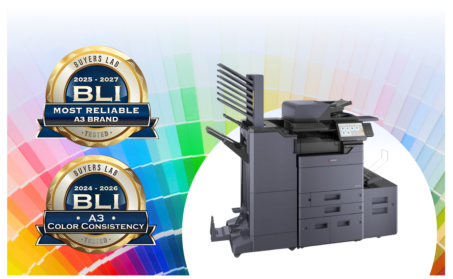
In fact, Kyocera has been recognized by industry experts for delivering some of the most accurate and consistent color output available. When paired with a Fiery color controller, you gain even greater precision, helping ensure your prints come out vibrant, balanced, and true to your design every time.
Ready to see the difference for yourself? Get a free quote or learn more about Kyocera solutions here!